LOGO AND BRANDING
LOGO DESIGN PACKAGES
CASE STUDIES
NANCY JACKSON DESIGNS
The Client is an accomplished silversmith and jewelry designer known for her intricately detailed pieces, each painstakingly created by hand using the highest quality metals, jewels, beading, and other materials and utilizing time-honored techniques. Every finished piece is carefully packaged in equally delicate and intricate packaging that reflects the work. Printed cards are included with each purchase to increase brand recognition. The initials within the Nancy Jackson Designs logo are a simple yet elegant black script, surrounded by two gently scrolling lines, representative of the delicate nature of the Client's work. The logo serves as a visually compelling complement to the Client's work and lends well to both web and print media.

OUR GLASS
Our Glass, as a successful restaurant, bar, and art gallery, was rebranding itself in a transition to an event venue. The Client's vision was of a wine glass integrated with the text of the title, in a loose and 'painterly' style that reflected the secondary purpose of the venue - as an art gallery. The font was created from scratch to closely match a similar look favored by the client. Named "Swish" the design features brush strokes in vibrant shades of red and purple, representing the liquid in the wine glass and creating a "pop" against the text. The resulting brand manages to be crisp yet free-flowing, and easily translated across media.
LUX LIVING GROUP
The Client was creating a new real estate team, and rebranding as LUX Living Group. The Client wanted to use typography as the main component of the design, with a focus on LUX, to convey a sense of luxury. The deep shade of blue lends professionalism and sophistication to the look. The addition of an icon featuring the double L (for LUX Living) marks a unique touch to the logo as a whole or as a standalone brand. The mix of serif and san serif fonts, both clean and crisp, complete the look.
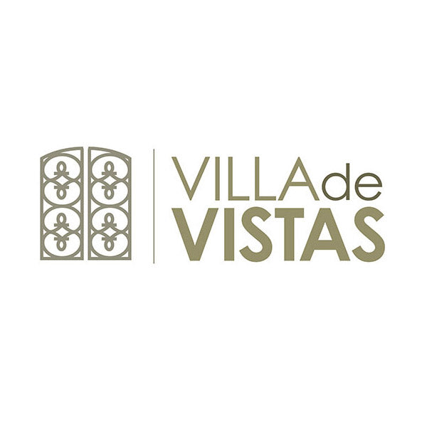
VILLA DE VISTAS
The client required a logo for a luxury Malibu property listing - a hillside luxury resort style home, featuring vast views and a grand set of wrought iron double doors that greet you at the entry archway. The logo is inspired by this feature, and welcome viewers through this portal into the fabulous and breath-taking property beyond. Given the intricacies of the doors themselves, no further embellishment is needed on the logo, and is completed by a simple and clean font. The neutral tone of the logo is a nod to the sand color of the materials used to construct the mediterranean inspired abode.
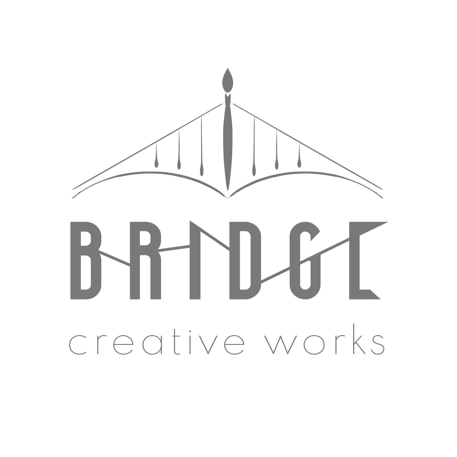
BRIDGE CREATIVE WORKS
BRIDGE is a creative studio and joint venture between a husband-and-wife artist team. Integrating their love for the arts and their experience in the visual and performing arts industries, the two have paired together to create one-of-a-kind musical instruments that serve as objects d'art. The "BRIDGE" name serves to honor that pairing, bridging the gap between the visual and performing arts. The use of paintbrushes forming a bridge as well as the lines connecting the letters of the title speaks further to the theme of connectivity.
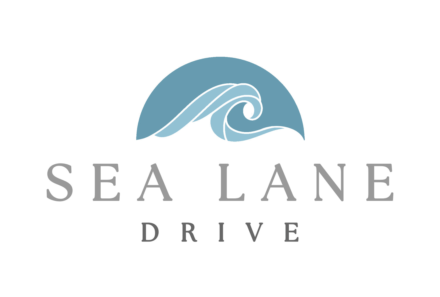
SEA LANE DRIVE
Creation of a custom logo for a Malibu real estate listing for the Client. Logos needed to reflect the eclectic and artistic aesthetic of the property, and incorporate teal/blue and silver, to capture the elegance of the home as well as its proximity to the ocean. The 'icon' for the logo was inspired by a stacked stone sculpture featured on the grounds and favored by the sellers, and the simple fonts that accompany the artwork work as a balance.
LIV REAL ESTATE
The client was opening a new real estate brokerage, and required a fresh logo for branding. The client requested a black and gold logo with clean, elegant lines.
The gold, stylized rooftop ties the LIV to the real estate industry, while remaining sleek and unobtrusive.
The pairing of the primary LIV text along with the rooftop graphic allow it to be used as a standalone 'icon' on both print and web.
CLAYTON LEWIS GROUP
Returning client Clayton Lewis was searching for a new look for his new real estate group. The goal was to capitalize on name recognition, with simplicity in color and design. The custom and clean font with angular edging is echoed in the CL "icon" resting above or left of the primary logo lettering. The look is elegant and easily applicable across web and print media.
SAFEPRO HOME WARRANTY
The project involved the creation of a brand for a new home warranty company in Ohio. The use of the "S" in a "lock" icon does double-duty as a representation of the "S" in Safepro as well as conveying safety and security for clients looking for protection for their home and its contents. The use of an icon along with the primary text allows for easy application across a variety of print and web media.
RIMROCK FARM
The Client requested a simplistic. streamlined logo focused on the name of the company, and/or the initials, with little additional ornamentation. The logo should be black and white, with clean lines ideal for easy identification and application across a variety of media, including packaging materials, as the brand was developed for a craft farm that would be utilizing the logo on a multitude of surfaces.

DAN HEINE REAL ESTATE
The Client has an existing logo for an established and successful real estate business. The Client did not wish to deviate tremendously from the existing logo, which consisted of an open door in his trademark red hue. The logo was given a slightly modernized makeover that honored the overall look and feel of the existing brand. Client's branding materials and social media posts often feature a white, black, or dark gray background, on which the new logo reads equally well. The clean and simple lines mean that the logo lends well to print and web media as well as signage.