DAN HEINE REAL ESTATE

BRANDING | LOGO
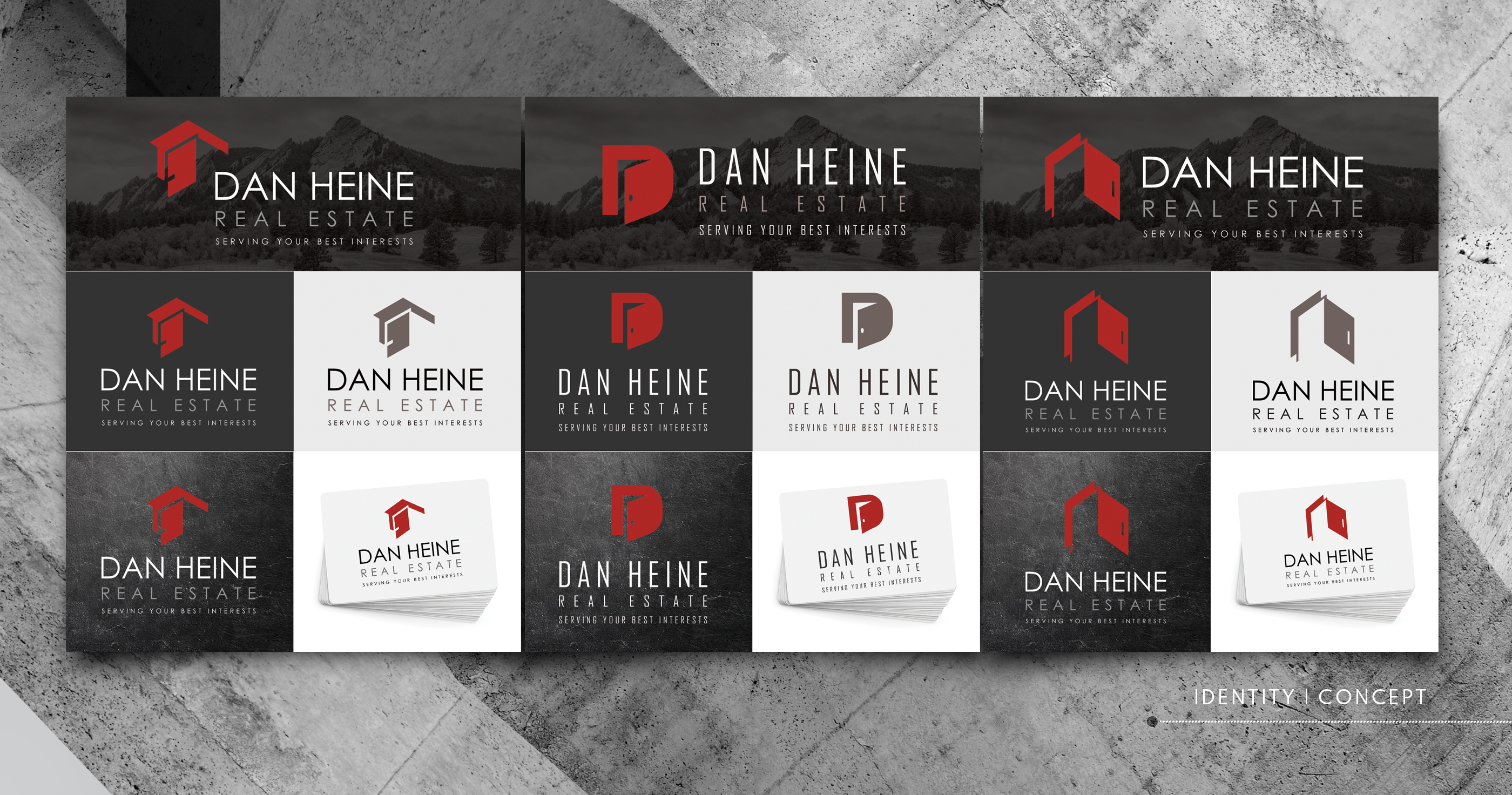
The Client has an existing logo for an established and successful real estate business. The Client did not wish to deviate tremendously from the existing logo, which consisted of an open door in his trademark red hue. The logo was given a slightly modernized makeover that honored the overall look and feel of the existing brand. Client's branding materials and social media posts often feature a white, black, or dark gray background, on which the new logo reads equally well. The clean and simple lines mean that the logo lends well to print and web media as well as signage.


SOCIAL MEDIA GRAPHICS
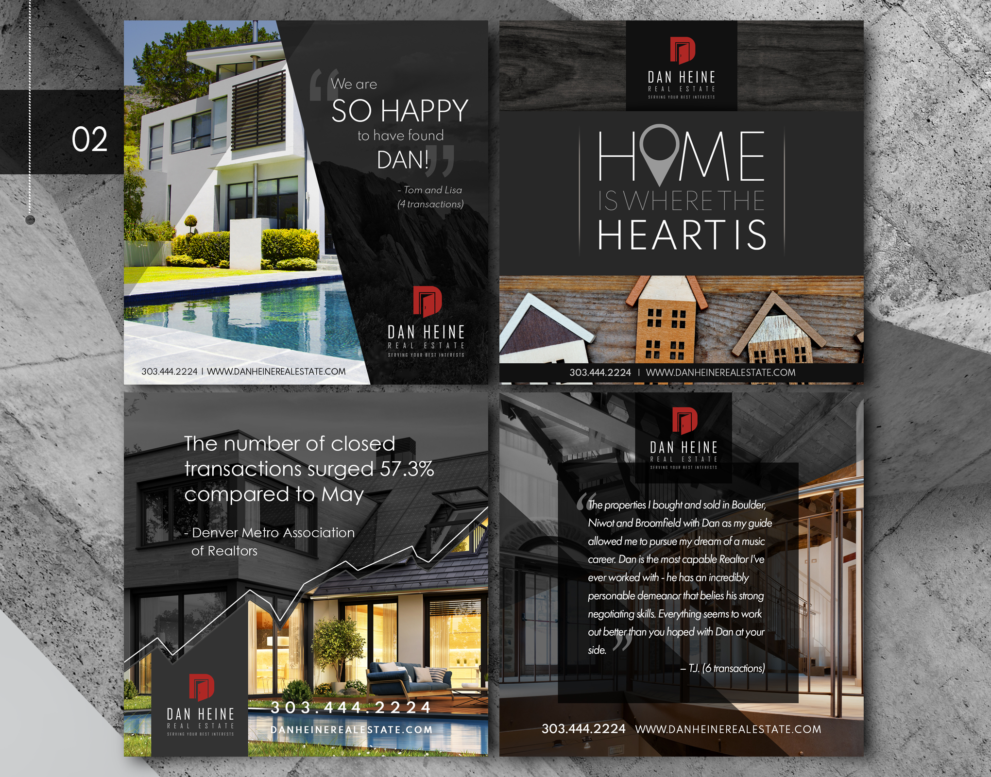
The Client employs a robust social media presence and posts daily. The goal was to provide the Client with a library of relevant and visually compelling social graphics for use across various outlets and touching on a wide variety of subjects that would appeal to viewers. The posts employed stock photography, the original photography of the Client, as well as original Vector graphics created by OA Graphic Design.Along with the large library of daily posts, the Project included the creation of a variety of headers that utilize the new logo and branded look for consistency across all web media.
