LUX LIVING GROUP & CLG
A NEW LOGO
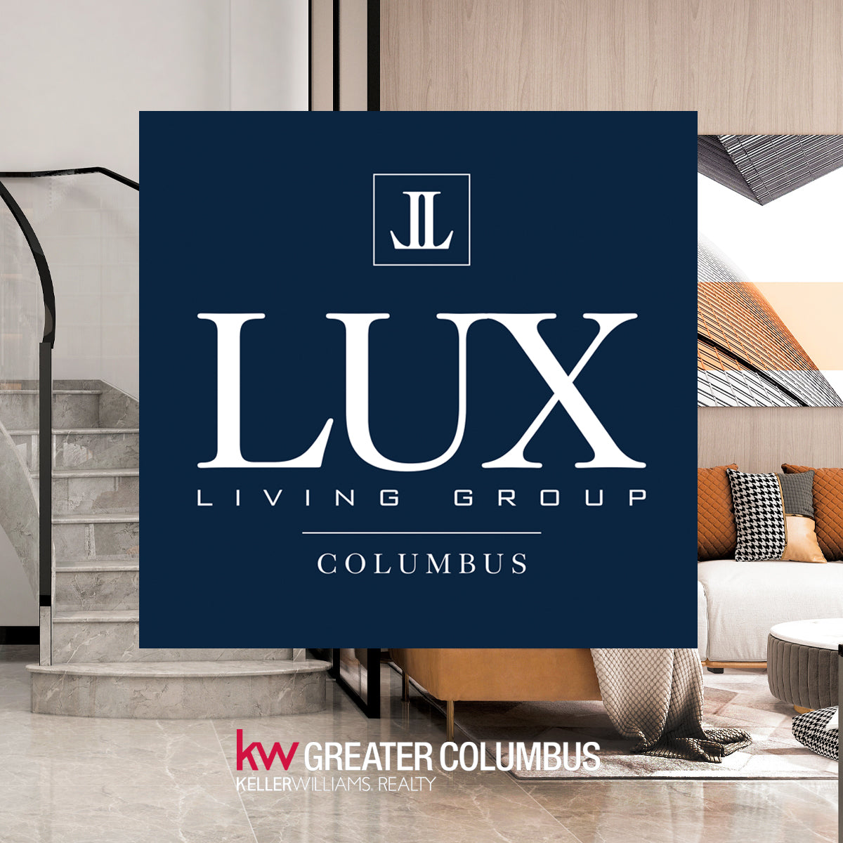
The Client required a new logo for his real estate team LUX Living Group. The Client wanted to use typography as the main component of the design, with a focus on LUX, to convey a sense of luxury. The deep shade of blue lends professionalism and sophistication to the look. The addition of an icon featuring the double L (for LUX Living) marks a unique touch to the logo as a whole or as a standalone brand. The mix of serif and san serif fonts, both clean and crisp, complete the look.
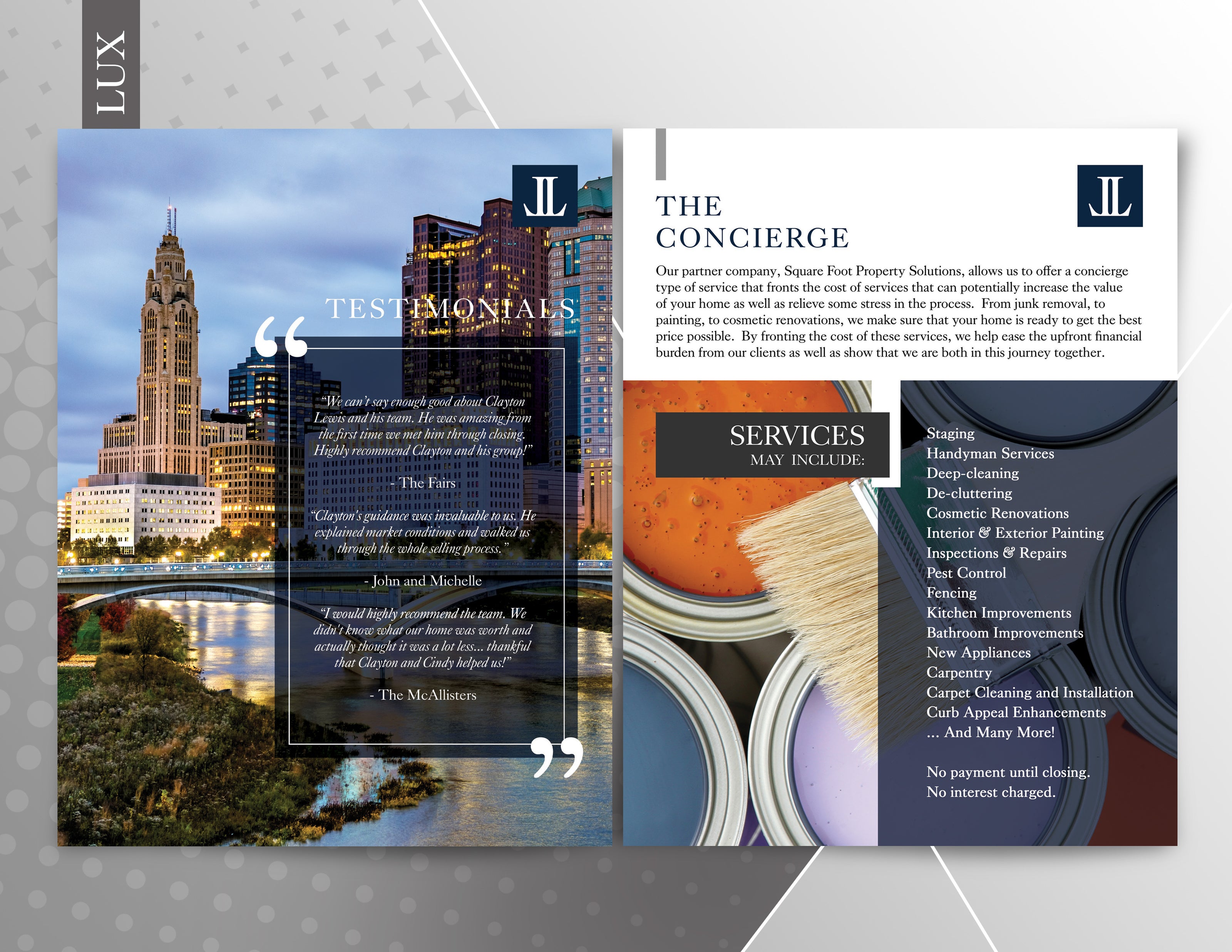
REAL ESTATE MARKETING
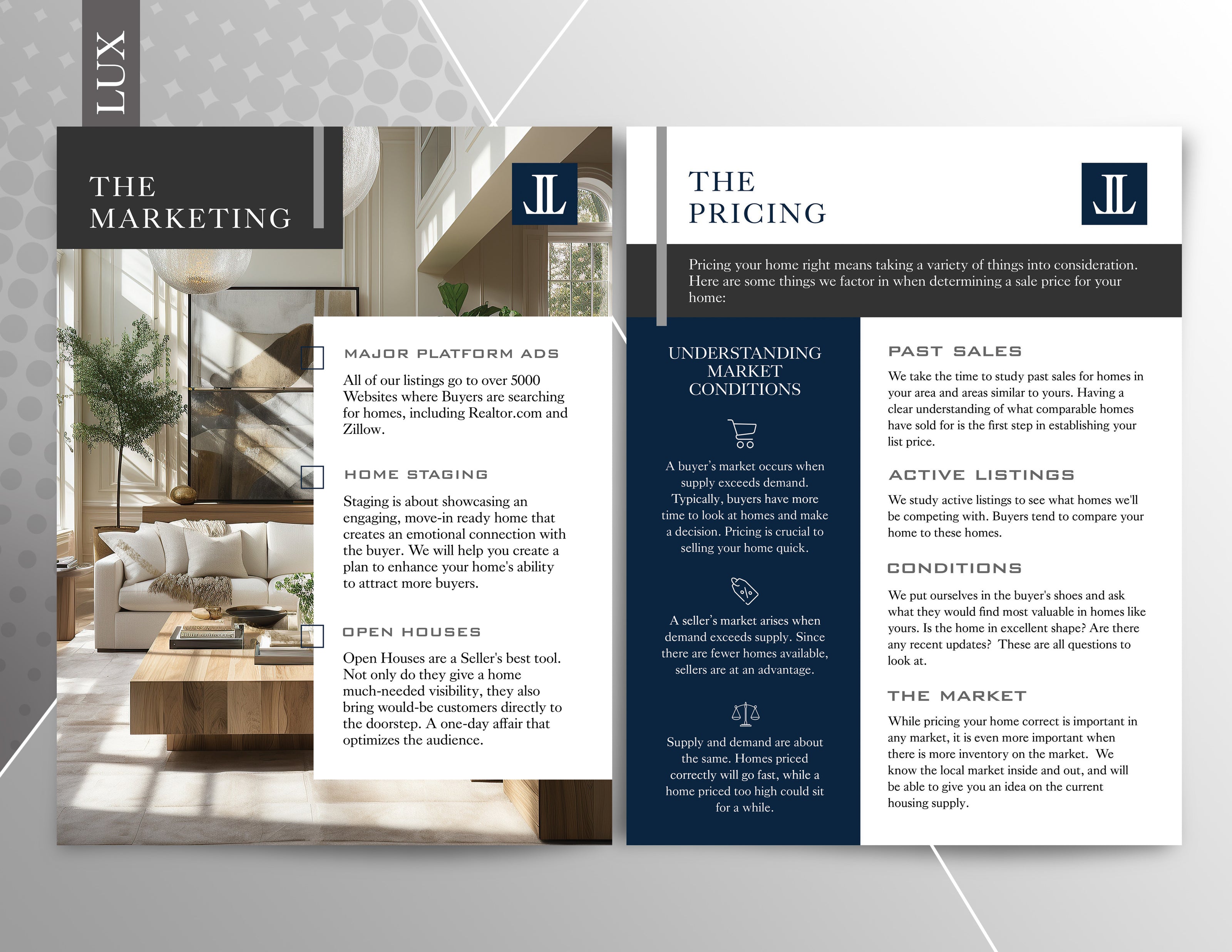
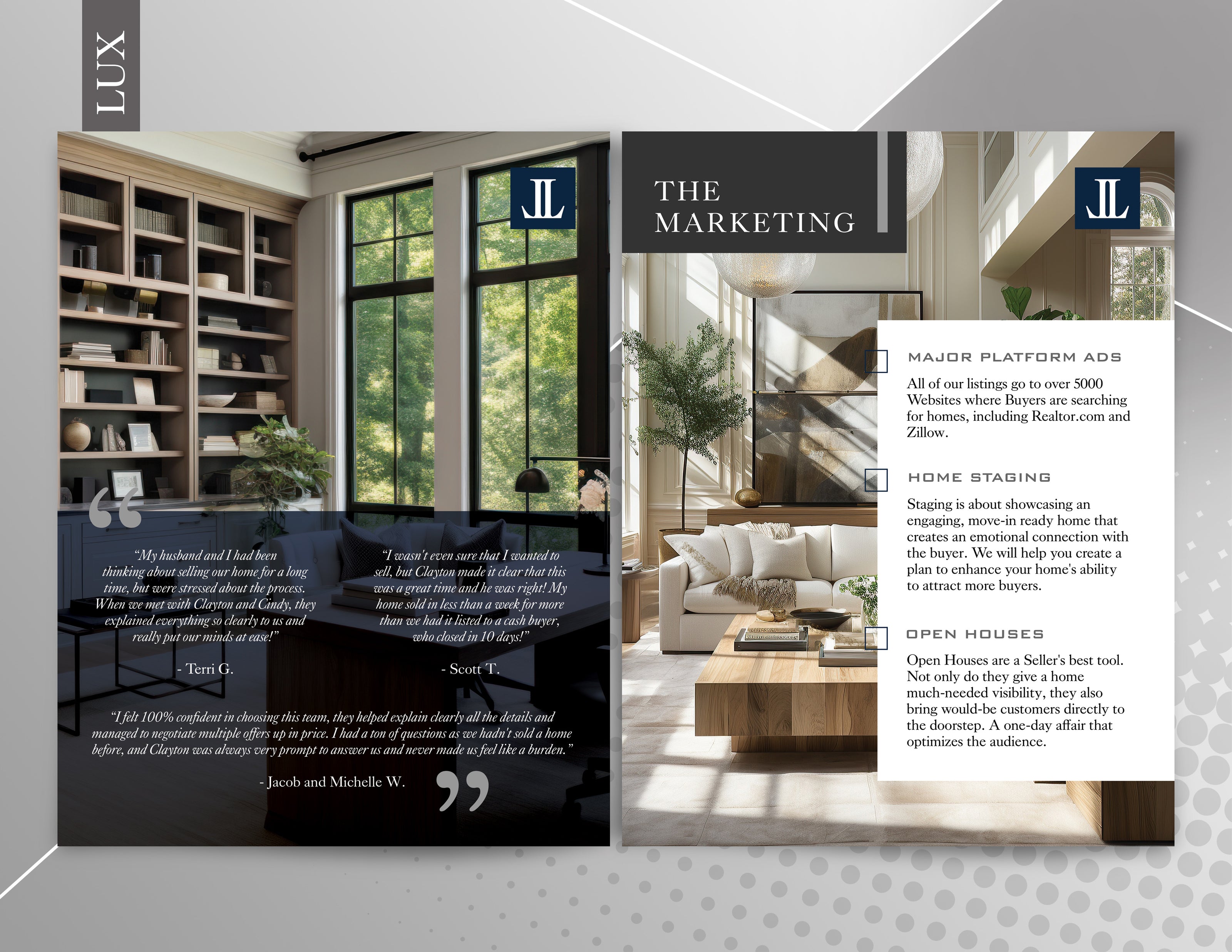
The Client requested a suite of marketing materials for print and web, featuring the new brand. The cohesive feel of the marketing is one of elegant luxury, with cool tones and clean lines. From new signage and social media graphics to presentation folders and listing brochures for new sellers, the use of muted palettes with vibrant accents carries the day and engages the viewer.

PRAISE FROM THE CLIENT
With time, often comes change...
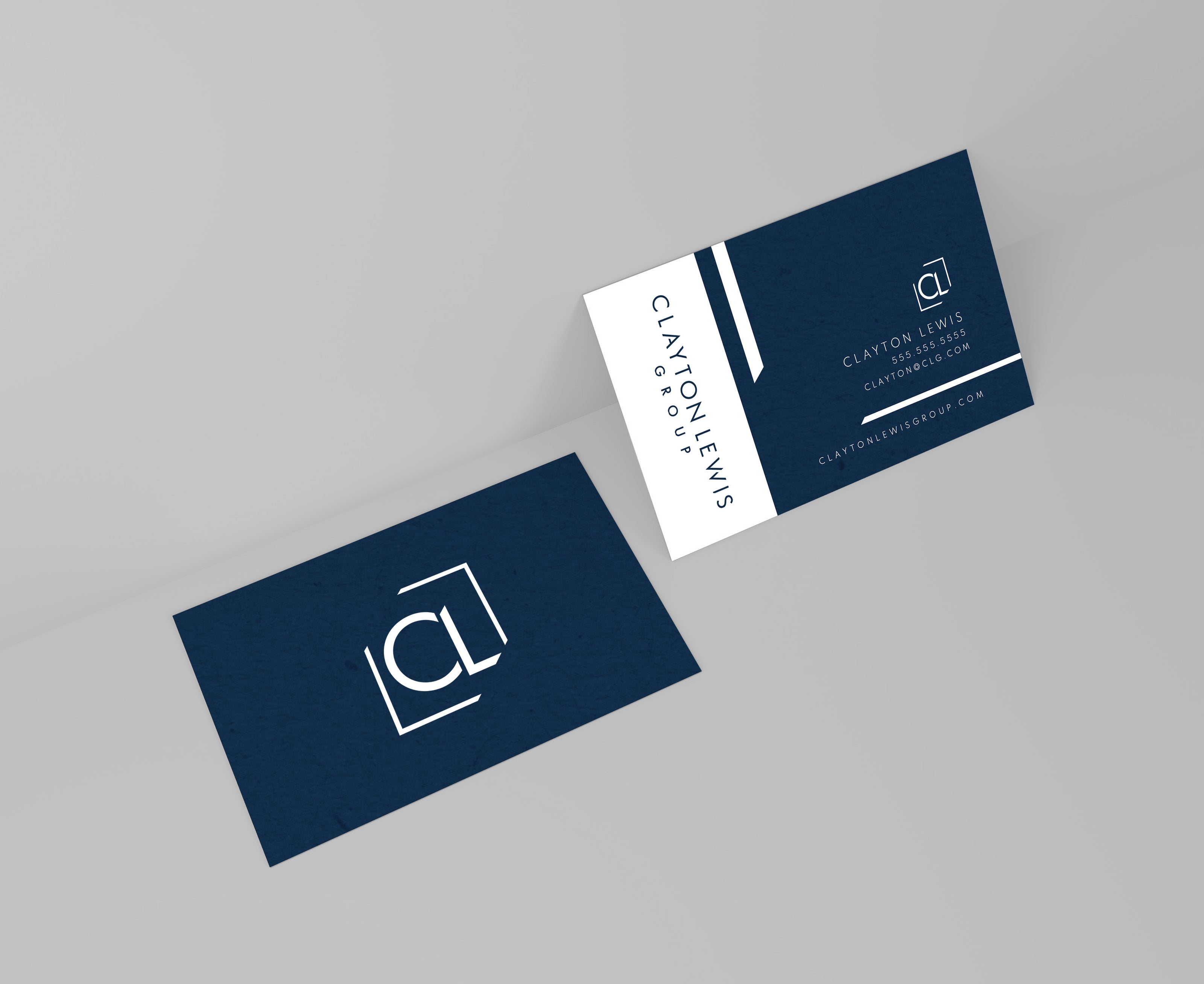
Returning client Clayton Lewis was searching for a new look for his new real estate group. The goal was to capitalize on name recognition, with simplicity in color and design. The custom and clean font with angular edging is echoed in the CL "icon" resting above or left of the primary logo lettering. The look is elegant and easily applicable across web and print media.